Top Examples of E-Commerce Website Checkout Pages You Should Know

Introduction
Building feature-rich eCommerce websites is not the end of the process, rather the beginning of the next one –how to make sales effectively! Modern businesses put in a lot of effort on the website pages to boost conversions. It includes different activities, including navigation streamlining, optimizing CTA, content optimization, upsell/cross-sell opportunity creation, etc. However, more than any other webpages, the eCommerce checkout page plays a very crucial role in revenue generation and increasing sales.
Here it is fair to mention that there is no white and black answer. Trial and error and other strategies can work well to resolve this issue. Here we have listed out a few eCommerce checkout pages which have done well in the industry. It will give you a clear idea about what you should be trying out in your eCommerce store.
Best Examples of eCommerce Checkout Pages
Without beating around the bushes, let’s dive in and go through some excellent checkout pages from eCommerce development ! We'll discuss essential functionalities, best practices, and strategies to optimize your online store for success.
1. Amazon
Amazon is always on the way of making improvements in the checkout process. Amazon is now making use of its own call-to-actions along with the traditional approach to come up with a unique combination for the checkout. Apart from that, Amazon saves the customers from wondering about the time of delivery by offering the fastest delivery dates on the product page itself. Amazon even uses its product page to display the EMI options and card discounts so that customers can make use of the discounts in the best possible manner.
Comparison with similar kinds of products and displaying the availability in different colors helps the customers to choose between the products as per their wish.
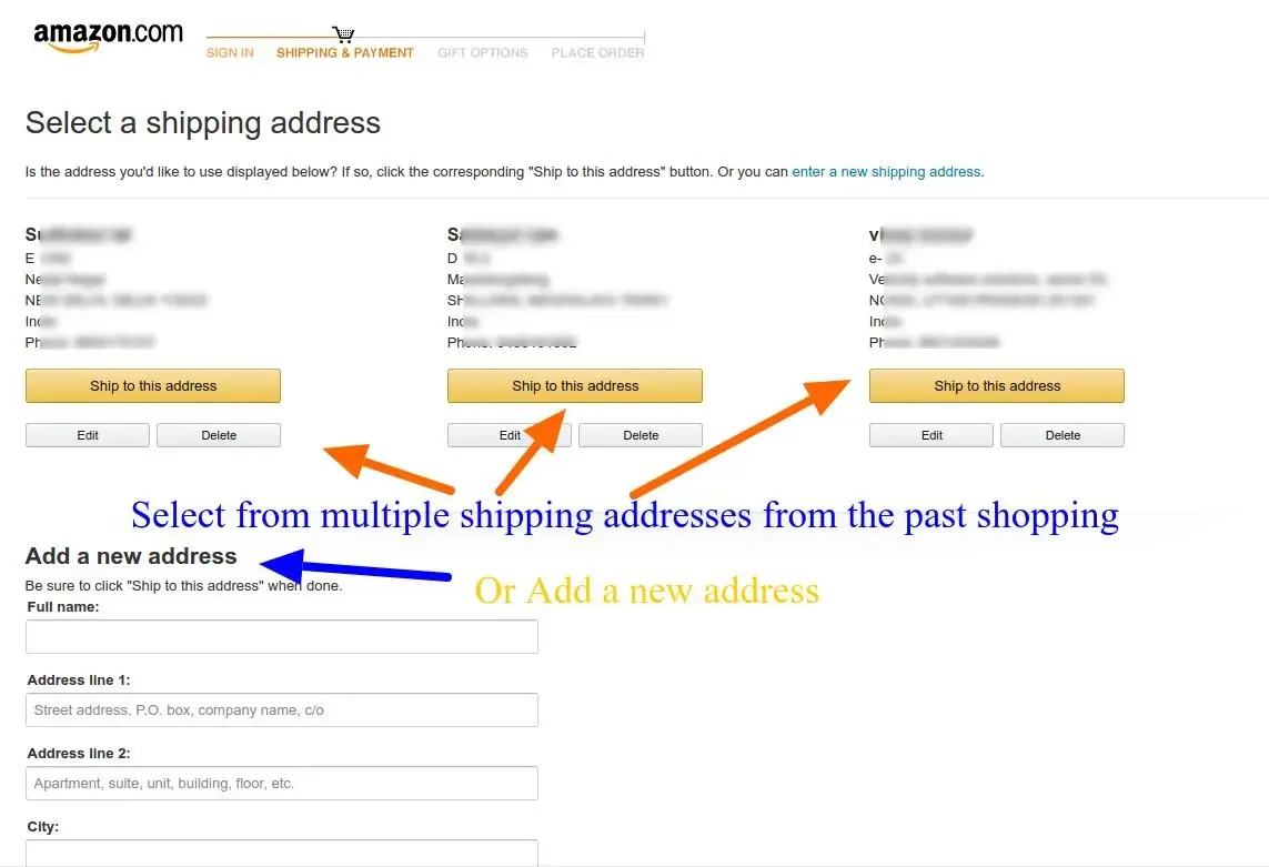
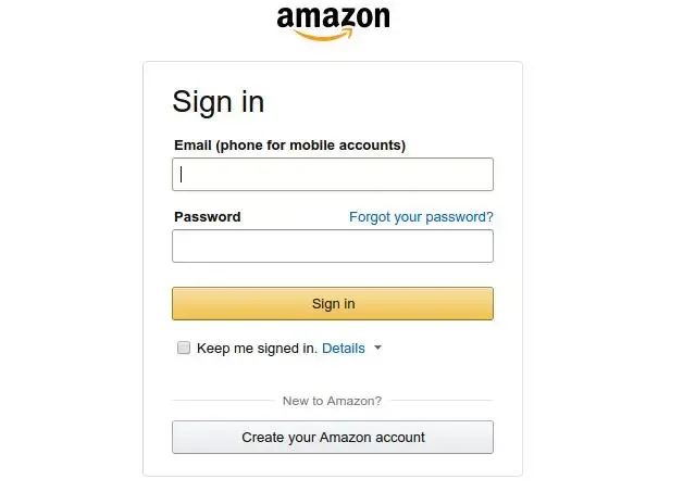
If we look at the eCommerce stores and visit their checkout section, you will see a lot of options involved in there. This includes continue shopping, add to wishlist, guest checkout, and much more. However, things are quite straightforward in the case of Amazon. Here it asks you to create a user account before you can proceed further. It comes with a quick account registration page asking for minimum information to register.
This way Amazon gets to ensure that the customers will move only in the forward direction without facing any kind of distractions. If your customers don’t mind filling up a small form then the approach of Amazon can work for you too.
2. Nike
When we talk in terms of checkout, speed remains as the priority concern for many eCommerce businesses. This is where Nike does a brilliant job by introducing PayPal checkout to ensure that things get completed in a secure and faster manner. Again, when users get to use PayPal, they don’t have to login separately. They can use their PayPal account to login and they will automatically move forward in the checkout process.
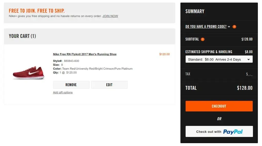
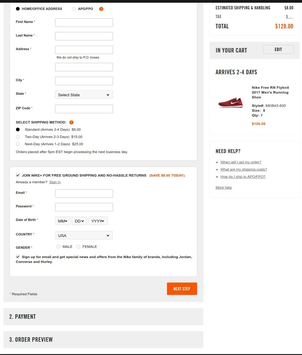
If you don’t want to go with PayPal, you can follow the regular checkout interface which comes with a partial on-page checkout. Here we have used the term partial because once you reach the page you will not have all the steps available at once. You will have the next step unlocked when you complete the previous one.
Now, here shoppers get to buy an item and complete the checkout without having to actually create a user account. They can do that process later! Moreover, the customer gets all the costs related to the purchase through the shopping cart summary which includes the price of the item, shipping charges, taxes, and other miscellaneous costs.
3. Myntra
If you are not looking for a single-page checkout or a guest checkout, then you should think about something like what Myntra has! Myntra comes with a multi-page checkout which comes with no guest checkout but yet is conversion-friendly.
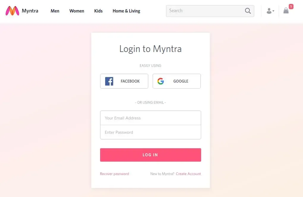
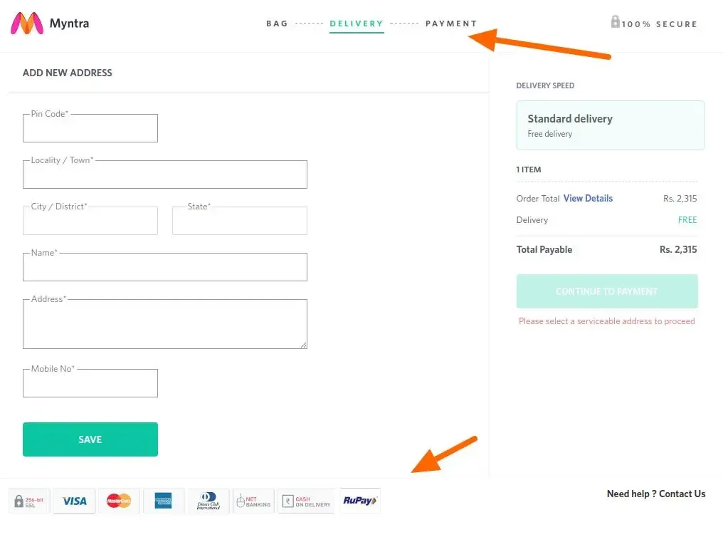
Here Myntra offers the customers to continue the checkout process by using their Google or Facebook account to continue as a registered user rather than opting as a guest customer. This way, customers can shop on Myntra without having the pressure of creating an account on the shopping site.
When you follow the checkout pages in Myntra, you will be properly guided throughout the process in a way that you will know where you are and what will be the next step. The customers also get to see a progress bar to know the steps are transparent. It also comes with the payment options logo over the footer and a logo of trust.
4. Apple
Apple the online store for all Apple products comes with a checkout page that is completely organized. It makes use of white spaces properly in a way that users have all the attention to the call to action buttons. The checkout page has been designed in a way that even the guest users can smoothly go through the checkout process and complete it.
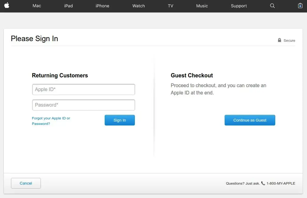
One of the main reasons for increased cart abandonment is the websites asking for account registration once the user starts with the checkout process. In order to deal with this situation, Apple comes with the option of guest checkout so that shoppers don’t have to go ahead with the process of creating an account by adding in all the information needed for registration just to buy the product or service they want.
Apple lets the registered users to complete the checkout process simply by signing in. Or else, they can simply go ahead by going for guest checkout.
The only issue with guest checkout is that no customer information will be saved within the database of the online store and so it will not be possible for the user to track back their order. If the user has no issue with it then having this feature on the website can be a good idea.
Moreover, Apple has ensured to offer simple and interactive checkout steps both for Guest and logged in users. Again, if the customer needs some help in the mid-way, there is a chat option that can be used to get answers from a real representative from Apple.
5. Bellroy
One of the main issues that Bellroy faced on its online store is the increase in shopping cart abandonment. The presence of a complicated checkout process can scare away your shoppers quickly and this has been one of the reasons for decreased sales among different online stores.
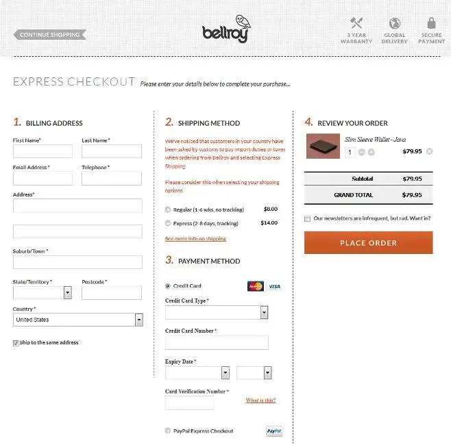
Compared to what Apple does, Bellroy has found a different way of its own to handle this issue. It has come up with a checkout process that has been placed within a single page. The customers always find a one-page checkout easy to understand and get done with. One-page checkout comes with a shorter and quicker to complete structure which means the customers will not have a hard time getting done with it. Just on the same page, users can provide in billing address, delivery address, payment details, and shipping options without moving out.
The online store can focus on offering better user experience by only asking for the crucial information of the user.
So, any online store which wants to offer a checkout experience that is quick, simple, and easy, you should opt for a checkout which is one-page. It also helps the customers to save some effort and time.
6. B&H Photo Video Prod Audio
The checkout page in B&H Photo comes with an attractive UI and is simple with fewer elements. Once you have added an item to the cart, you will receive a pop-up window which will show all the details related to the purchase along with the items that are related to it. If you already have any item added in your cart then the product listing page will show the details of the same.
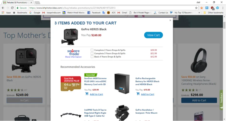
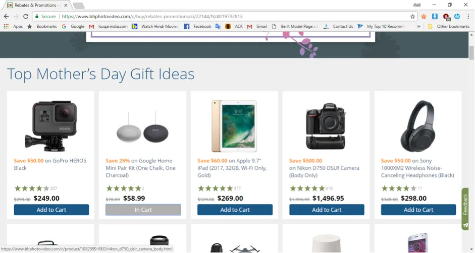
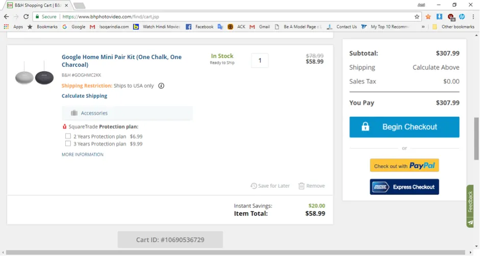
You can follow different options when you are on the checkout page. You can either continue with the checkout process or opt for express checkout. Users can proceed with the checkout as a guest user or as a registered user. Some of the best practices that it follows are to offer transparent information about the products as well as the ability to add or remove an item that is already present in the cart.
You will find here links for the Return Policy and Shipping Policy below the checkout button. Again, to help a user in case he or she faces any issues, the page comes with information like customer care number, Live Chat, sales support number, and contact information.
7. ASOS
ASOS is one of the prominent eCommerce stores in the fashion industry. Here, once you have decided the item you want to purchase along with color/size, etc. you will find a pop-up come up. It offers you the option to go back to the bag or go ahead with the checkout. It offers you a summary of the selected items along with their images.
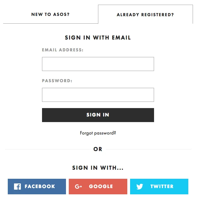
You can continue with the checkout process as a guest, or go ahead and sign in/register. The checkout page comes with a summary of items you chose, left side with the actions you need to follow starting with a space to add in a promo code you have, followed by a field to recognize your email. The right side of this webpage consists of all the details of the product you chose.
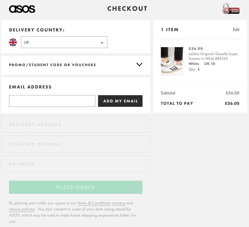
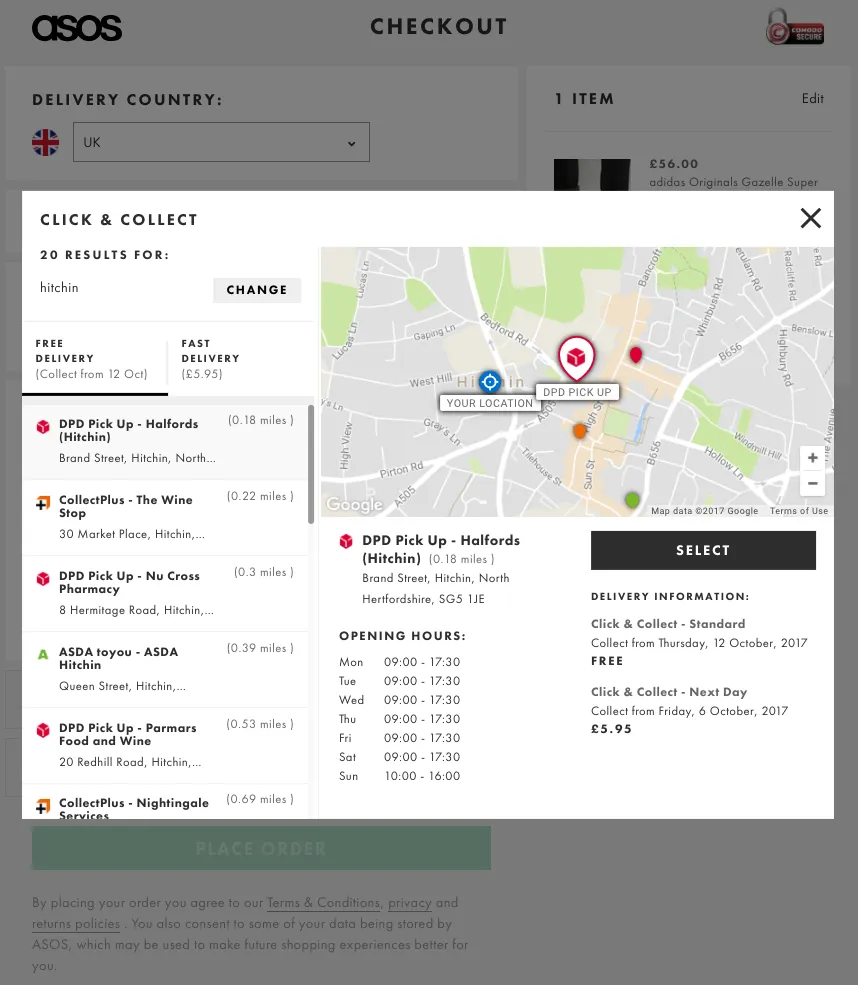
The next section is about product delivery. Here you have the click & collect option and an option to add in your delivery address. You also get a flexible option to choose between a fast delivery and low-cost delivery along with the price and expected date of product arrival.
In order to provide delivery updates, the new customers are requested to provide their name and mobile number. Lastly, it asks you to fill in your billing address and provides you a new summary including it. After that, you will be offered the option to make payment and place an order.
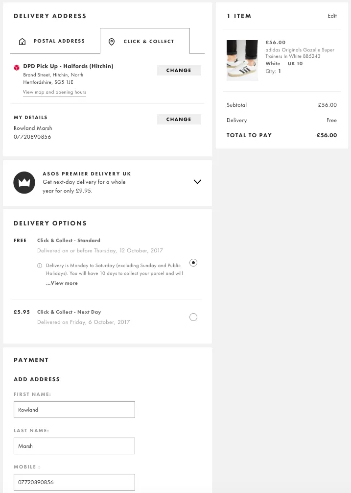
The checkout page is simple and makes use of less attractive elements and colors but, uses of the right functions which are needed to get ahead.
Looking for Professional e-Commerce App Development Services?
Contact UsFinal thoughts
All these checkout pages have made their way to the customers in an effective manner. This does not mean that they are only the best ones you can have! This simply means that these checkout pages come with some valuable information that you could use for your eCommerce site as well. Different checkout pages give you an interesting view of how things can turn when a certain feature is applied there.
Silicon IT Hub can make robust and user-friendly online stores with desired features and flawless functionality. Contact us to learn more about the scope of our web design and development services for your company.


 Have an Idea?Let’s Build It Together!